This month’s website makeover spotlight goes to The JJs Declutter Podcast! We were excited to roll up our sleeves and give this vibrant show’s site a fresh, more balanced look — with visual updates that make it easier to navigate, more inviting for new listeners, and a better showcase for their great content.
🎯 Objective
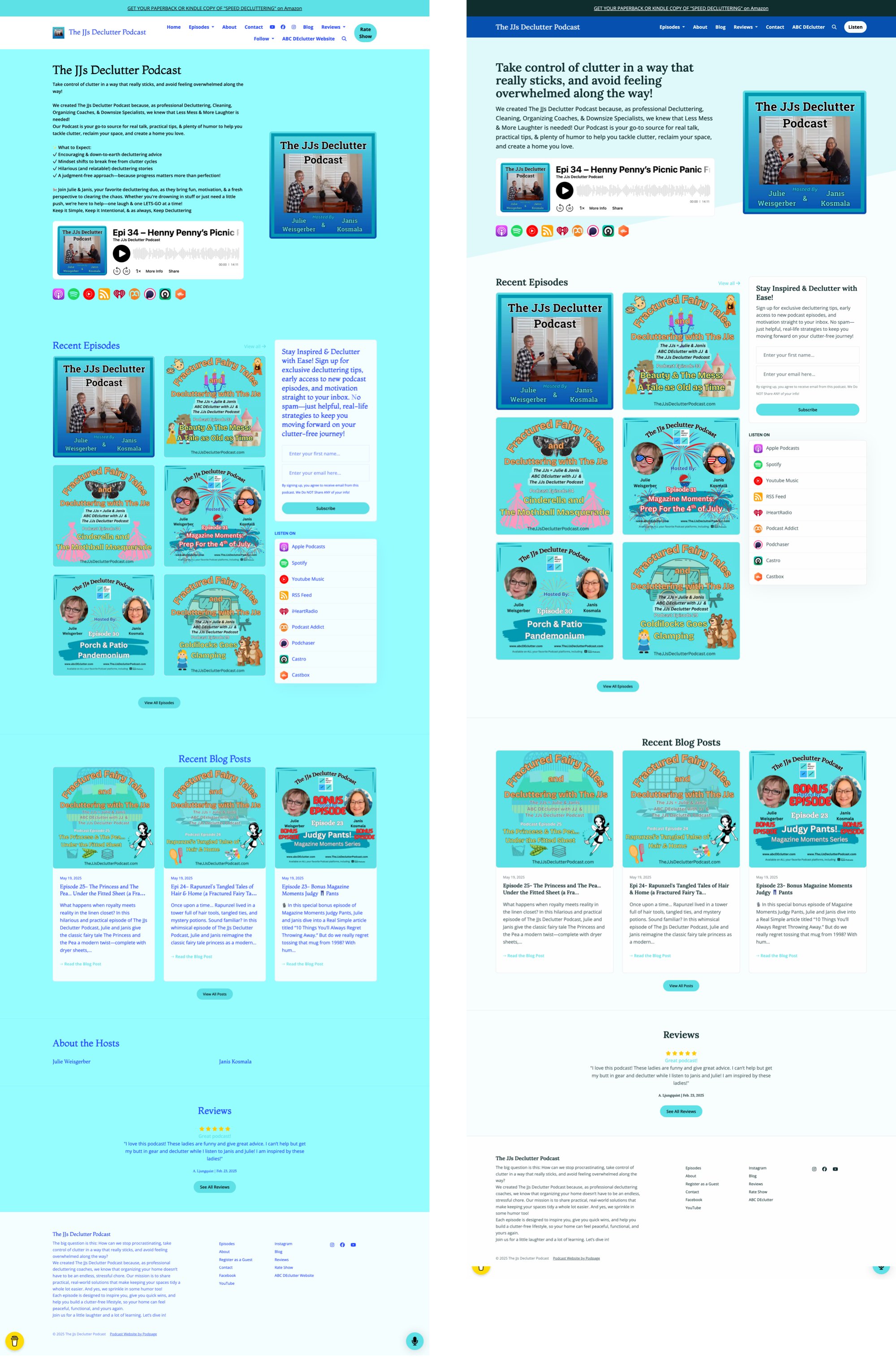
To improve the user experience, visual hierarchy, and clarity of The JJs Declutter Podcast website by addressing color imbalance, layout density, and content organization — ultimately making it more appealing and accessible to new and returning listeners.
❌ Before: Identified Issues
1. Overwhelming Color Usage
Heavy use of baby blue throughout the site made the background overpowering.
Conflicting shades of blue (e.g., royal blue text in nav) reduced visual coherence and legibility.
2. Navigation Bar Clutter
Navigation links wrapped onto two lines, making the header appear disorganized.
Poor contrast in nav text color reduced readability.
Redundant social links in the header despite footer presence.
3. Dense Header Section
Introductory text appeared as a “wall of text,” making the site feel unwelcoming at first glance.
Lack of hierarchy between title, subtitle, and call to action.
4. Call-to-Action Dilution
“Follow” language lacked clarity in what action users should take.
Sign-up section was visually large and copy-heavy, diluting the main call to action.
5. Visual Competition with Episode Artwork
Strong background colors competed with episode cards, drawing attention away from content.
Inconsistent spacing and lack of subtle background framing reduced visual balance.
6. Missing Host Biographies
The hosts appeared in the artwork but had no accompanying bio or context on the page.
The “About the Hosts” section was underutilized and content-light.
✅ After: Improvements Made
1. Refined Color Palette
Replaced solid baby blue with a light, barely-there tint to retain brand while allowing content to stand out.
Header now uses a darker blue for structure and contrast.
Announcement bar at the top uses an even deeper blue, visually separating it from core content.
2. Streamlined Navigation
Navigation links now fit neatly on a single line, improving flow and aesthetic.
Royal blue text was replaced with a dark blue background and white links for better readability.
Removed redundant social icons from the nav; they remain in the footer.
3. Improved Intro Section
Intro content restructured into title + concise paragraph, making it easy to scan.
Tone is friendlier and more focused on helping new visitors understand the podcast’s purpose.
4. Focused Calls-to-Action
Replaced “Follow” with “Listen” to create a more direct and intuitive CTA.
Slimmed down the sign-up section: now just two simple text blocks, styled to be inviting but unobtrusive.
5. Wider Layout & Card Emphasis
Increased overall page width to better accommodate modern screens.
Subtle background and spacing make episode and blog cards pop, drawing user attention to content.
More consistent card layout across episodes and blog posts.
6. Content Consolidation
Removed placeholder “About the Hosts” section due to lack of content.
Cleaned up footer and bottom sections to avoid redundancy.
📈 Outcome
Improved readability and visual hierarchy, especially for first-time visitors.
Stronger content emphasis with episodic artwork now commanding attention.
A more professional, welcoming, and intuitive site structure that supports listening, browsing, and subscribing.


